
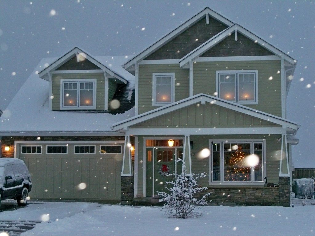
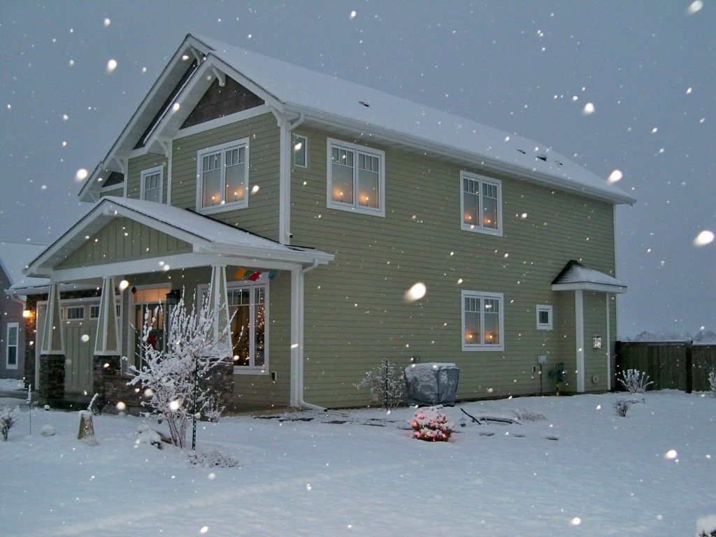
It feels like I posted Part 1 of our new house tour a year ago! ;-) Sorry for the delay on Part 2; I took these photos in December while the house was decorated and had hoped to post it by New Year's weekend, but things conspired to send my good intentions down the loo, and this post took even longer to put together than the last one despite being primarily limited to just one room! But it is, after all, the heart of the home so far be it from me to be a total slacker with this post.
So, picking up pretty much where we left off, here are a couple of views from the kitchen into the living room/dining room area. We redesigned the kitchen island, in the foreground, from the small, odd and inefficient "space module" island in the original floor plan...
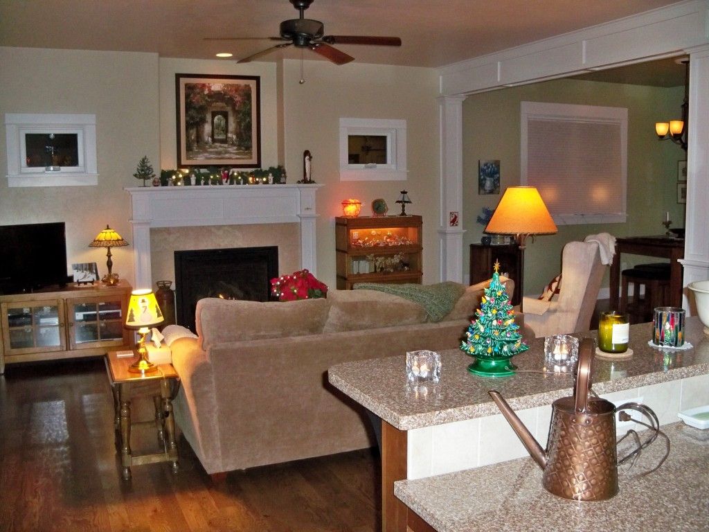
See Part 1 for info/links for the paint colors, hardwood floors, fireplace, art piece, windows, etc. As with that post, I'm sharing links to some of the products used in our house, and this time some links to a few favorite "accessories" as well! :-) (As I mentioned in part 1, we shopped around and hit a lot of great sales, special offers, or got items through our builder and/or subs, so the prices currently listed on these web sites are usually far higher than what we paid).
Watering can: Behrens 1/2 gallon copper embossed from Amazon.com
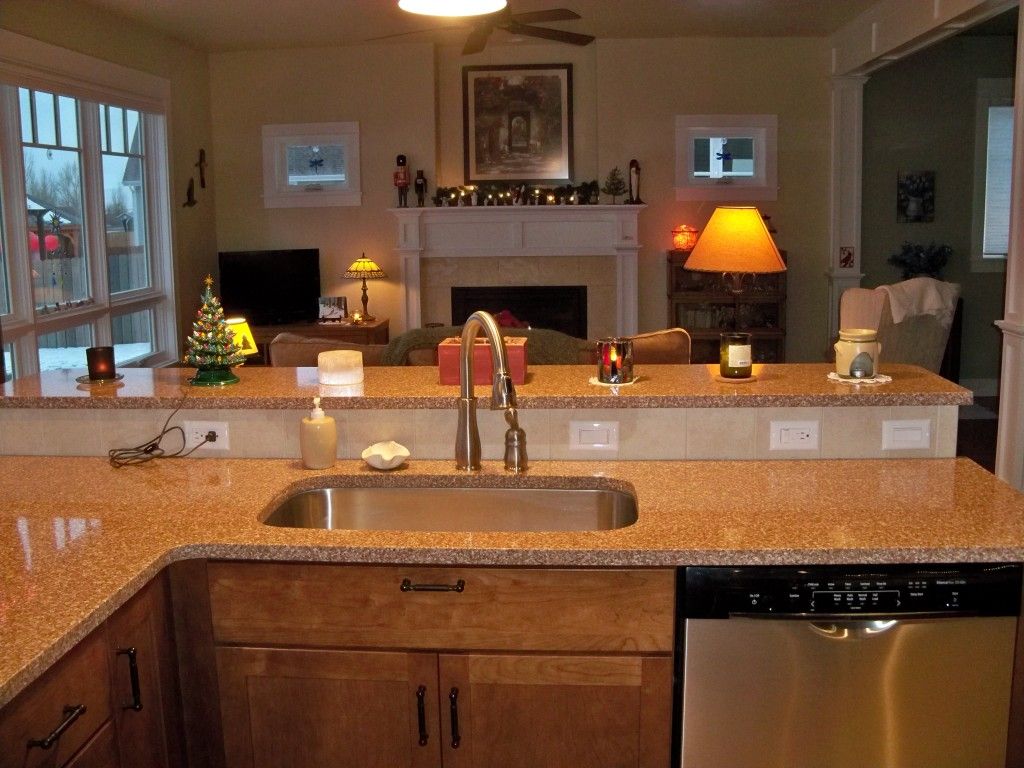
The drawer beneath the sink is a tip-out, stainless-lined storage tray. I'd never had one before and I LOVE it! It's so nice to have sponges, etc off the counter and out of sight.
The dishwasher is so quiet, I usually have to look at the light panel to know if it's running!
The dishwasher is so quiet, I usually have to look at the light panel to know if it's running!
Faucet: Delta "Leland" Single Handle Water Efficient Pull-Down
Dishwasher: Bosch Ascenta Series in stainless steel
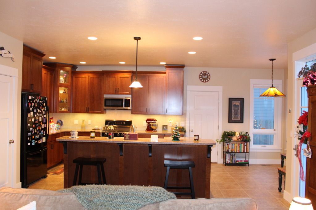
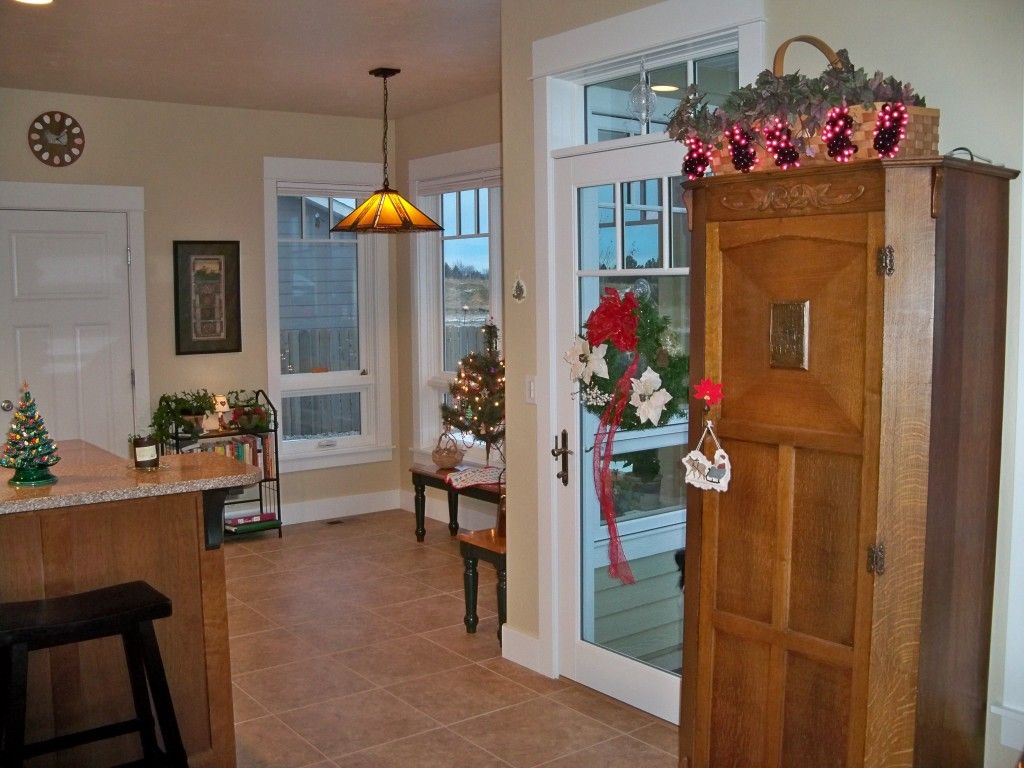
This photo, though not my favorite since it looks like I took it on the deck of a listing ship, does the best job of showing the majority of the kitchen and nook. The pantry door is on the left, the door to the garage (which the floor plan lacked and we added) is straight ahead, and the French door to the patio on the right. The garage door leads to the "3rd car/storage area" portion of the garage, which in our family's case is our dogs' heated kennel with a dog door to the back yard.
A better, though smaller, photo of the same area...
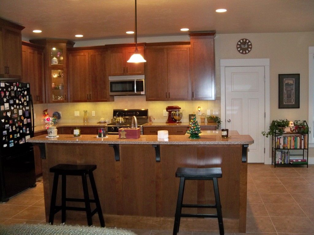
Kitchen Island pendant light: Royce "Essex" mini pendant from Lighting Direct
You can just see Willow peeking through the patio door. The dogs love to peer at us, Snoopy Vulture-like, through that door and low awning windows when they're outside. :-)
The oak wardrobe is an antique from England, purchased from an antique dealer in Dallas right after we got married. Moving it is always a bit traumatic, and it always gets pride of place in our home. Here's a closeup of the basket of grape lights, which some of you may remember I bought as a housewarming present to myself when we sold our house and moved into Dragonfly Cottage. :-)
Wall color: Sherwin Williams "Kilim Beige" SW-6106
Ceiling Color: "Divine White" SW-6105
Trim color: "Pure White" SW-7005
Tile floor: Daltile Fidenza 18"x18" in "Cafe"
We were able to get this tile less expensively at a local flooring store than at Home Depot. We used the same tile in our front entry, but in the 12x12" size.
We chose epoxy grout for all the tiled surfaces in the house except the kitchen backsplash and are very glad we went to the additional expense, especially in the kitchen. We just had no luck sealing and/or cleaning regular grout in our old house. Epoxy grout needs no sealing and wipes clean with water - even when it's taken a hit with pomegranate juice! :-) And since we had an excellent professional install all the tile, he had no trouble with the challenges of working with epoxy.

We had some difficulty choosing a kitchen countertop surface that worked with our budget and our criteria for looks, durability and ease of maintenance, sustainability, and future home resale. BW really liked soapstone (far too expensive, and I didn't want gray countertops), while my first choice was recycled glass - I had my heart set on Vetrazzo - but that proved difficult to find in our area, and cost-prohibitive when we finally located some in Montana. After researching and eliminating other possibilities, it came down to a choice between granite and quartz. After studying several articles and helpful tools, including these...
...and shopping around at our local building supply/design stores and comparing countertop samples to our chosen cabinet colors, we'd pretty much decided on quartz, preferring the look, available colors and ease of maintenance. Then the decision was virtually made for us when we learned that one of our two top quartz choices had been substantially marked down due to "inventory overstock" at one of the local countertop fabricators. The fabricator we'd chosen (he was far less expensive and came highly recommended by our builder) was willing to match the sale price, and the deal was done. We're happy with our choice with one exception: quartz slabs are smaller than most granite slabs, so we have an extra seam. And though our installer did a good job (well, not at first - we had him come back and vastly improve one of them), seams still show, especially when the sunlight hits them. I don't know that we would have made a different decision knowing this, but the deed is done, we love the look and ease of the quartz - and we more or less came within our builder's paltry countertop allowance for the entire house. (We did end up with granite in the guest bath when we got a killer deal on a beautiful remnant that went perfectly with our chosen tile and vanity colors!)
Countertops: LG Viatera Quartz "Tenerife"

Here's a closeup of the plaque over the pantry door. Can't remember where we bought it years ago, but have seen them for sale in various places since.
Our kitchen cabinets were the first thing we chose, figuring we could more easily match flooring tile and countertops to the cabinets than vice versa. Given that this was one of the bigger expenses in the home, we once again did our homework first:
These were helpful, though once again our budget, product availability, looks and features were also key to our decision. And once again we shopped around - at Home Depot and two local kitchen design places, one of which dropped the ball and never bothered to give us a bid. In the end, Home Depot's prices and features on our choice of Kraftmaid cherry cabinets could not be beat (and then we ended up lucking into a great sale on top of the already better pricing and free features!) And we adored our designer, Rachel, who moved to Virginia when her fiance was transferred there just as our project finished! We were incredibly lucky to work with her, and she was as delightful as she was skilled. Kitchen design would have been pretty stressful otherwise.
The cabinet color and style were surprisingly easy choices since we knew we wanted a warm, rich color (we went with cherry with a stain color called "Chocolate," so I love to tell people I have a kitchen made with chocolate covered cherry!), and a simple Shaker style to go with our Craftsman home.
Then the hard part started.* Veneer vs solid center panels (the awesome sale was for the veneer, so that decision was made for us), glaze (no, it costs 10-15% more and I don't like how it looks on Shaker style doors), drawer fronts (we went with slab, which we preferred and was standard so didn't cost extra at the time, but now it does), soft-close (oh yeah, on every cabinet door and drawer in this house! It was one of the free features with these cabinets), full extension drawers (highly recommended!), the Lazy Susan style (we chose an upgrade; "Easy Reach" with wood shelves, no center pole), full or partial overlay (ours our full), how many roll-outs (we have four, including two huge ones beside the range where we store our skillets, pots & pans and casserole dishes - and they're so handy we still wish we had a couple more... but there's always the after-market!), all the other available features like cutlery trays (we passed on most of them), and of course the cabinet sizing and placement. Rachel did a great job helping us with placement (and was invaluable in helping us redesign our island), and we love the layout of our kitchen, which is very efficient and user-friendly. Where we goofed a bit was in the cabinet height. We wanted the end and corner cabinets to reach the 9' ceiling (for complicated carpentry reasons, they don't quite reach it) and the others to be a foot shorter so I could put crocks and baskets up there. We even had the electrician install a couple of outlets above the cabinets so I could put little white lights among the greenery in the baskets. What we failed to take into account was the 4" tall crown molding - there'd be room for my baskets up there, but only if I could fold them flat first to squeeze them between the molding and the ceiling! Oh well, now we're thinking of putting LED rope lights and artificial grapevines up there instead - just haven't had time to make it happen yet.
*This is handy stuff to know when shopping for kitchen cabinets!
Kitchen cabinets: Kraftmaid "Layton" in Cherry with "Chocolate" stain, purchased through Home Depot.
See our pizza stone inside? :-) Can't live without that baby!
(I don't recall the brand of ours, but it's similar to this one)
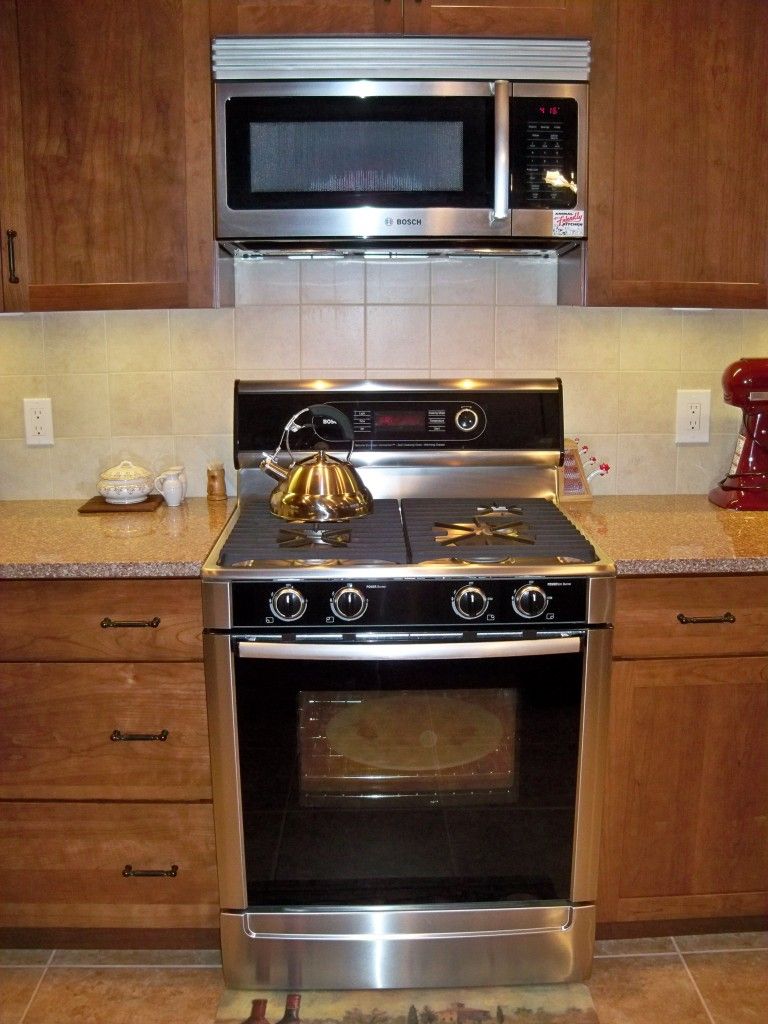
We were also somewhat challenged by our decision on appliance colors. I'm fond of white appliances and love the fun, playful colors offered by companies like Big Chill, Smeg and Aga - but none of those were going to work in this Arts & Crafts, Tuscan-themed, earthy kitchen (or within our budget!) What would work was black or stainless steel. Not a big fan of stainless steel - I think it's an overdone trend that may be close to playing out, especially given the extra maintenance required to keep smudges at bay, and the "commercial kitchen" look is really not my style. But it's still considered high-end, and around here at least (Wyoming is usually about a decade behind any current fashion), it's still very popular. So again, with resale in mind, we felt compelled to consider it. I refused, however, to have a stainless fridge. Polishing the one in Dragonfly Cottage was a royal pain in the arse, but the real deal killer was the fact my magnet collection wouldn't stick to it! :-) So we chose a black fridge... and, hedging our bets, a combination of black and stainless for our other appliances. Again, we hit a great sale - the President's Day sale at Sears combined with additional savings on Bosch appliances. We wanted to get the microwave in black, but conditions of the sale required we buy the stainless one. I actually like our stainless dishwasher, which matches our sink and faucet nicely, but I really love our range. This was one of our splurges - we wanted dual fuel and were willing to pay the extra $ for it, and have no regrets. We love cooking on gas burners and having the consistent results and zero hassle of an electric oven. This range has been awesome, and we like its looks, too! (The microwave is just okay).
Range: Bosch dual fuel gas range
Microwave: Bosch Microhood

We ordered the corner cabinet doors without glass, since it was substantially cheaper to have our local glass place cut pieces of glass to fit them. We chose seeded glass for a vintage look you can easily see through.
The backsplash appears to have a greenish tint to it on my computer monitor, but in real life it's a very neutral off-white that matches some of the quartz in the countertop. Nothing fancy, but we like the clean and simple look.
Here's a closeup of the stained glass rooster light; again, I can't remember where we bought it years ago, and unlike the "Vive Bene" plaque, I've never seen one exactly like it since!
Cabinet Hardware: Liberty Sisal Pull in flat black
Backsplash: Daltile Briton 6"x6" Field Tile in "Bone"
LED Under Cabinet Lighting: Model UCB Double Row LED from Broadwax (top item in third section from top)
LED puck lights in corner cabinet: Maxim Light Disc Starter Kit from Lighting Direct
This guide was a very handy resource when buying LED lights, especially since we prefer "warm" light temperatures...
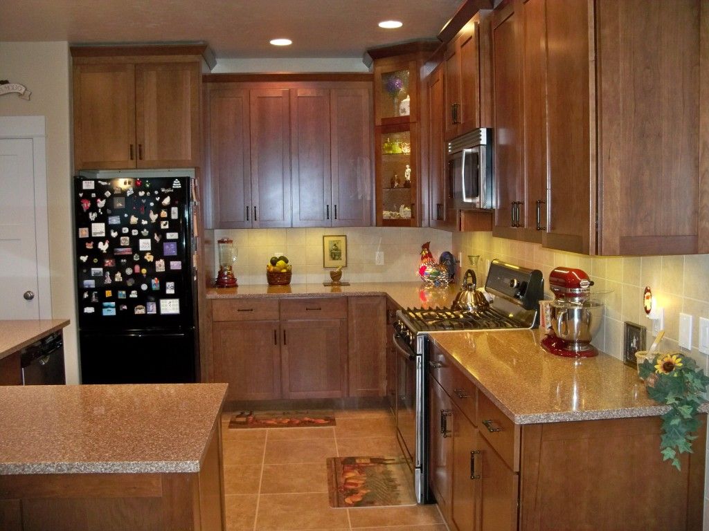
The kitchen viewed from the nook
Since there are just the two of us and we have an additional refrigerator in the garage (the original Jenn-Aire that came with our Big Horn house that we bought in 1991, can you believe that?), we bought a small fridge but had the space for it constructed so that with the easy removal of a spacer trim piece, a larger one can fit there.
Blender: Waring Professional Bar Blender in Chili Pepper Red from Amazon.com (purchased 10 years ago next month and still going strong!)
This photo is payback for Ellie C (aka Elephant's Child!) :-) Not the most focused photo, and the glare from the nook windows or flash is giving me fits - but I have an idea so will keep trying and will replace it if/when I get a better one...
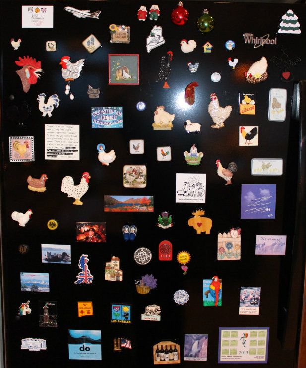
The magnet collection: a big reason our fridge isn't stainless steel! :-)
Refrigerator: Whirlpool Gold 22 cu. ft. Resource Saver™ Bottom Freezer

And here is the nook viewed from the kitchen. The cupboard on the left is one of these
(only we went with a single, since we have our recycling containers in the garage).
Bookstand: ORE International 3-tier metal book rack from Amazon
Since our pub table is taking the place of a dining room set for now, Willow has commandeered the nook with her bed and water bowl (Tess and Josie love their big garage kennel, but want nothing to do with coming in the house!) The nook is a strategic spot that's perfect for being first in line for handouts of her favorite from-the-kitchen treats: raw red cabbage, broccoli, cauliflower, mushrooms and carrots!

Spoiled rotten? You betcha! Wouldn't have it any other way. :-)
Dog: One-in-a-million border colllie/collie mix adopted from local shelter. Highly recommended. :-)
Another photo I've shared before but that feels appropriate to share again here: our nook light. The one light fixture I intend to take with us when we move!...
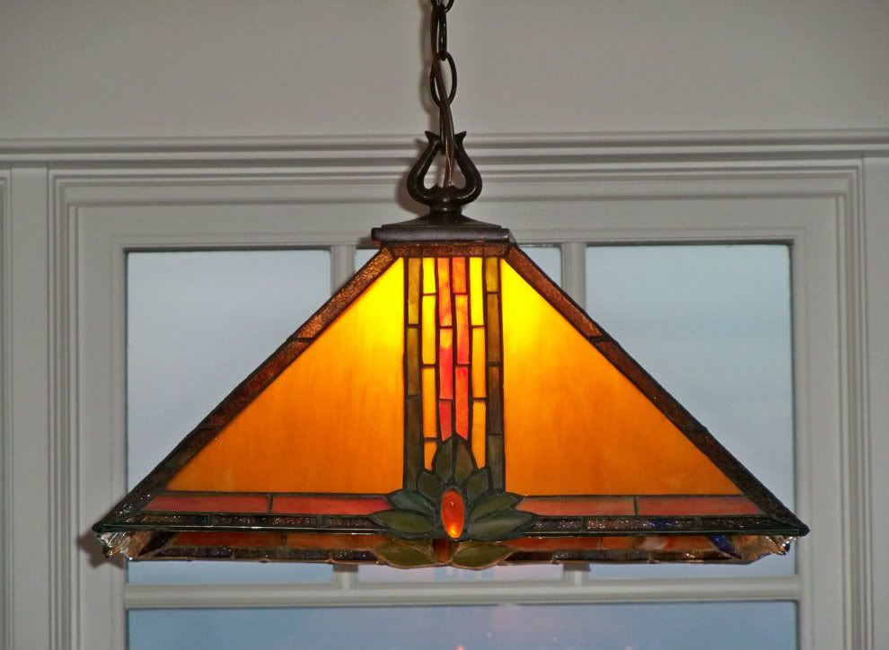
"Maple Jewel" Tiffany-Style Pendant Light from Lighting Direct
The final part of the house tour (it certainly won't be a "holiday" one anymore, unless I don't get around to posting it till next December!) will be the upstairs, but I honestly don't know when that might be. Some of it is still a work in progress.
Thanks for coming over for another tour! As your reward, here's a treat...
Applesauce Ginger Cake with Maple Glaze
Or as we call it, Gingersnap Cake - because duh, it tastes just like gingersnaps! :-) I made this for the first time this weekend and we devoured it (before I even thought to take photos, but no matter since Susan's pictures are better than any I'd have taken anyway). I made no changes to the recipe, just used sucanat for the sugar (as usual), which was a perfect sweetener for this cake. I intend to make it again soon, and this time will reduce the amount of sucanat to 3/4 cup, since the cake was sweeter than we're used to. But so moist and yummy! Bon appétit! :-) (Update: It's perfect with the sucanat reduced to 3/4 cup!)


