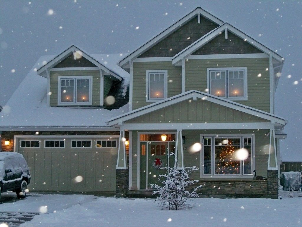
To part 1 of the holiday house tour of our new home!
Most of you have watched it materialize from a vacant lot and ambitious idea to my last construction post, published when it was still a mess just four days before we closed on it and moved in back in late August. It's been an exhausting whirlwind, and I'd be lying if I said we were completely settled, organized, landscaped, decorated and FINISHED. But, it's far enough along for a tour, at least of the downstairs (which is the only part we decorated for the holidays, if you don't count the candles in the upstairs windows!) :-)

Since we built this one from scratch ~ from finding and making changes to the floor plan to researching and choosing every single bloody item, finish, style and color in and on the house, I thought I'd include a few details. I've noticed that several visitors to my blog arrive from Google searches for things like paint colors (that I mentioned on past remodeling/redecorating posts), and we found really helpful info and ideas on blogs and websites that shared details about the various phases of new home construction (two that were especially helpful were Houzz and de Jong Dream House: Building Terms). So I'm sharing some info of our own for anyone out there, now or in the future, who is building, remodeling or decorating and might find it helpful. If you see anything you're curious about that I haven't shared a link to or info about, don't hesitate to ask. I've bookmarked nearly every source and resource from this project! :-) The prices shown on a lot of these linked sites are now in most cases not what we paid - I've noticed a big increase in some of them, and we hit a lot of great sales and got some wonderful deals. It really pays to shop around or to wait for a good sale if time is not of the essence.

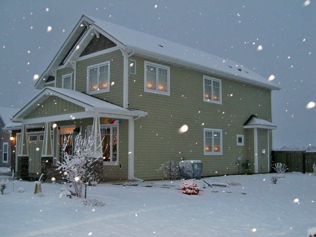
The south side of the house
with "Stockbridge" window style
Siding color: Sherwin Williams "Svelte Sage" SW-6164
Front Door: "Connected Grey" SW-6165
Exterior Trim: "Extra White" SW-7006
But I've kept you standing out in the cold and snow long enough. Come on in!
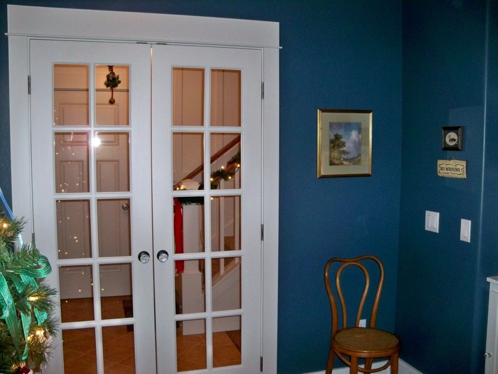
The front entry way and the study's French doors from the staircase.
Hallway wall color: Sherwin Williams "Kilim Beige" SW-6106
Interior trim color throughout house: "Pure White" SW-7005
You've seen a couple of these photos of the study in past posts, but here's a more comprehensive look...
A re-run from my Christmas Eve post, I'm including it because it's the only photo
of the study that shows the big window, which is one of its best features!
Wall color: Sherwin Williams "Smoky Blue" SW-7604
The Command Center of the Starship Mehitable Days :-)
Some of you might also remember the ceiling lamp from a past post, but it's been awhile and I thought it deserved a second look.
The hallway and front entry from the living room (dining room's on the left).
I hate that floor runner.
Hallway ceiling color: Sherwin Williams "Divine White" SW-6105
Front Door: "Connected Grey" SW-6165
Looking down the hallway from the front entry into the living area.
The short little door on the left leads to the crawl space.
Floors: White oak with custom 1:1 mix of Minwax "Special Walnut" and "English Chestnut" stain with two coats of satin polyurethane
Looking into the hallway from the dining room.
The cute quilted Santas wallhanging was made by our own AdventureJo! :-)
The door leads to the little powder room, tucked under the stairs.
The powder room is so small, it's nearly impossible to photograph. This is my attempt to capture the pedestal sink and one of the hardwood HVAC vents (I think those are cool!), without capturing myself in the mirror! :-)
Having suffered several water leaks at our old house, we have them throughout this one wherever a leak might occur. Could save a lot of grief and expense.
Wall & Ceiling color: Sherwin Williams "Misty" SW-6232
Looking into the dining room from the living room.
The pub table, bought for our tiny dining area in Dragonfly Cottage, is supposed to go in our kitchen's breakfast nook. But lacking a dining room set, at least for now, our pub table is having to fill in. Sure makes the dining room look big! :-)
Dining room wall color: Sherwin Williams "Grassland" SW-6163
Ceiling color: "Svelte Sage" SW-6164
Took this one without a flash. It's not great, but I like the warm, cozy glow of it!
We had a hard time deciding what to put on the dining room wall. We really couldn't afford another framed art print, especially one large enough. We looked at metal wall art, but didn't find anything that fit our taste or Craftsman style home. Then we looked at tapestries and found this one. We like the warmth and texture it provides, and it was more affordable than framed art.
The oak lawyers bookcase belonged to my grandfather (who was a surveyor, not a lawyer; hope the ABA doesn't find out he had one of their bookcases, lol), and is still home to my rocking horse collection. :-) The cardinal picture on the post to its right is a quilted postcard, again made by my very talented friend "AdventureJo". (Click here for a closeup!) And the antique radio to its right, which still has all its vintage vacuum tube guts but doesn't work, I bought in 1986 for $30 from a roadside antique stand in New Mexico for my little TV to sit on. Now it displays Texas Bluebonnets from our wedding (we got married in Abilene, TX).
Wall color: Sherwin Williams "Kilim Beige" SW-6106
Ceiling color: "Divine White" SW-6105
The Kilim Beige walls in these living room photos have a greenish cast to them (on my monitor) that is not how that color actually looks. The color is much closer to the color of the Travertine tile around the gas fireplace, only lighter.
We added the two little windows to the floor plan, and are so glad we did. And we LOVE our gas fireplace! The tile surround is travertine (at BW's insistence!)
We had the alcove above the mantel wired for the television, but then decided we like our TV just fine on the media cabinet to the left, so hung a picture there instead. The next people can put their TV up there if they want to!
I thought it would be fun to include a closer view of my snowmen collection, though I miss my bay window where I could display them all with my birdhouses like a Christmas snowman village. (The little snowman holding the fox that's featured in my current holiday header is third from the right). :-) You can also barely see the very wee row of blocks, spelling out "NOEL," that I tucked into the mantel trim on the righthand fireplace column (beneath the tall Santa, which is made from a fencepost!) It fits there perfectly! I wasn't very satisfied with how our mantel was decorated. Next year, I'm thinking a garland draped across the front, along with our stockings. would be nice.
We ordered the picture above the mantel from AllPosters, figuring it was a perfect size, would go well with our wall color and coordinate nicely with the colors in the adjacent dining room, and because we liked it. I didn't realize how much I liked it till later when I was sifting through some of the images I've saved in my Photobucket account over the years and found this one! It was one of the first ones I ever saved there several years ago. I hadn't recognized it when we found it at AllPosters, but I guess when you really like something, you really like it! :-)
(We bought the art print, matted and framed, which is no longer available. So this link takes you to the unframed stretched canvas product at AllPosters)